
Before we look at the content of a good test report, we need to understand the purpose of the report.
Technical teams working on a project have various means to provide status update to each other. This includes daily stand-up meetings, formal/informal defect triage, weekly project meetings etc.
Senior management/stakeholders, on the other hand, need to be informed via formal status reports. They are not concerned about the nitty-gritty of the project. Instead they are interested in how the project is tracking, is it on track or not, will the delivery date be impacted, are there issues with the project, is it still within budget etc. So when sending test report to senior management/stakeholders, we need to ensure that it reflects those requirements. We need to take care that we do not over complicate the report or include details that are not required.
Here is what a good Test Report should include. I am assuming adequate test coverage (traceability matrix) and proper test planning, ahead of test commencement.
First, it should have a summary section. This is where you report in verbose terms the status of the project. Use bullet points. Include risk and assumptions under this section.
Second, it should have a table showing the status of test execution. Visual cue helps stakeholders understand the progress of test execution for the project. Use a color code (Green, Amber, Red) for status field. Green means test execution is going good. Amber means project has existing issues but it has not reached alarming state yet. Red means project is in trouble. This could be SDLC, budget, schedule etc.

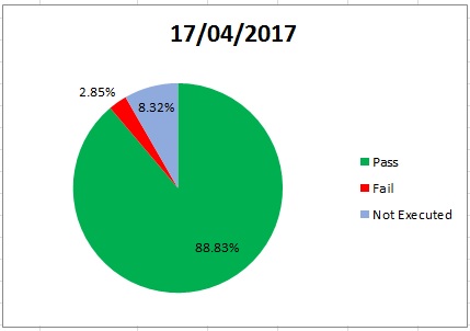
Third, use a pie chart to show the test execution status. Remember, a picture tells a thousand stories. While the same data is represented in the previous table, a pie chart visually allows the audience to quickly grasp the test status.
Fourth, use an s-curve to show the daily test execution progress. An s-curve is a chart that, based on number of days of testing and total number of test cases to execute, can plot a graph that shows the expected daily rate of test case execution. The way the s-curve works is, at the start of the test cycle, you are dealing with environment issues. Many core features may also not work. So your test execution progress will be slower. This is shown in the slow rise of the s-curve. As you sort out the features, in the middle period, test execution will accelerate as you go through your test cases quickly. At the end of the cycle, once the code is stabilized and majority defects are closed, you will run regression test over and over again to ensure that core functionalities tested at the start of the cycle are not broken. Hence test execution progress will slow down at the end of the s-curve.
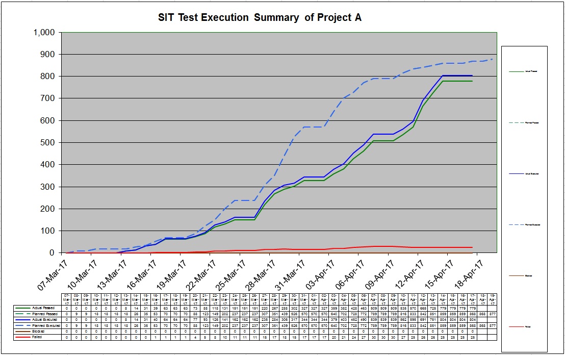
In the above diagram, the dotted line is the projected rate of daily test execution. As a Test Manager, you need to ensure that you are always ahead of the dotted line. If you fall below the line, then you may have to put additional resources to make up for lost time. Thanks to my previous boss (who developed this projection), this s-curve is now an essential part of the test practice that I run.
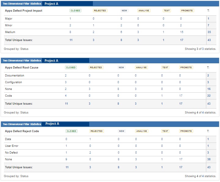
Fifth, you need to show the current defect status. I would recommend categorizing defects by severity (critical, major, medium, minor), defect root cause (was it due to faulty code, incorrect requirement, environment issue, user error etc.) and rejection code (why did the developer reject the code). By categorizing defects, we can look at our own work practice and improve. For example, if majority of the defect root cause is code, then that signifies that the quality of the code delivered was not good. If significant defects are due to user error, then test practice and how defects are raised by testers needs to be reviewed. Similarly if significant defects are due to missing or incorrect requirements, then project needs to review how requirements were gathered. The below statistics were extracted from JIRA (our main defect management tool).
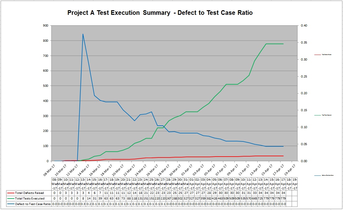
Sixth, we need to show how the project performed in terms of defect resolution. A key metric I use for test reporting is “Defect to Test Case Ratio”. It means Total number of defects/Total number of Test cases executed. For a good quality project, I would expect the defect to test case ratio to gradually decrease as testing progresses throughout the cycle. Why? Because as we continue to execute more test cases and developers continue to fix open defects, we expect fewer defects to be raised in later part of the testing cycle. So total number of test cases will continue to increase while total number of defects will not increase proportionately, thereby contributing to a smaller defect to test case ratio. In the event that defect to test case ratio increases, I would be extremely worried as to me that signifies degradation of quality code.
In the below diagram, the blue line (defect to test case ratio) has a downward trend, signifying that code quality is improving. The horizontal trend (at the end) denotes that no additional defects have been created at the later part of the test cycle.
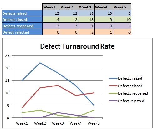
Seventh, we need to show defect turnaround time. If defects are not being resolved on time and the queue is growing, that could mean that additional development resources may be required on the project. Also if defects are being reopened increasingly then that signifies that incorrect fixes are being delivered to test. The below graph is vital in identifying gaps in development practice of defect resolution. Ideally we would like to see downward trend for all the lines, except defects closed (which should have an upward trend).
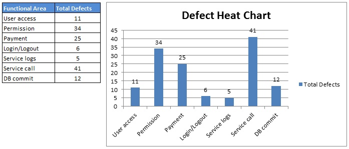
Eight, we show the defect heat chart for functional areas. What the heat chart does is shows which functional area have attracted the majority of defects. If those area were developed by a vendor, then that will give cause for concern. This can also highlight any deficiency in the development space. In addition, areas that experience the most defects, need to be tested more thoroughly and need to have larger test coverage.
Please remember this is just a guideline. Different Test Managers will have different reporting formats.
As long as these core items are reported, senior management/stakeholders will be well-informed.
